All guides
No guide matches your search.
Add a task pane with groups of links
Use MxTaskPane to show groups of task links beside your content. Groups can expand, collapse and close, and an item click runs your code.
On this page
MxTaskPane is a side pane like the task pane of the Windows XP file explorer. It shows groups with a header. Each group holds items, and most items are links that run a task. The types are in the Mordex.Windows.TaskPane namespace.
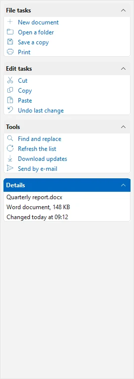
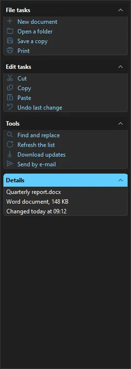
Groups of tasks and a details group
Add the pane to a form
Create the pane and dock it at the side. Give it an image list for the item icons and set ImageSize to the size of those icons.
using System.Drawing;
using System.Windows.Forms;
using Mordex.Windows.TaskPane;

MxTaskPane pane = new MxTaskPane
{
    Dock = DockStyle.Left,
    Width = 270,
    ImageList = icons,
    ImageSize = new Size(16, 16)
};
Controls.Add(pane);
In Visual Studio you can drop MxTaskPane on a form and add groups with its Groups Designer.
Add groups and items
A TaskPaneGroup takes its header text in the constructor. A TaskPaneItem takes a text and an image index. Add items to TaskPaneGroup.Items and groups to MxTaskPane.Groups.
TaskPaneGroup file = new TaskPaneGroup("File tasks") { Expanded = true };
file.Items.Add(new TaskPaneItem("New document", 0) { ToolTipText = "New document" });
file.Items.Add(new TaskPaneItem("Open a folder", 1));
file.Items.Add(new TaskPaneItem("Save a copy", 2));
pane.Groups.Add(file);

TaskPaneGroup edit = new TaskPaneGroup("Edit tasks");
edit.Items.Add(new TaskPaneItem("Cut", 4));
edit.Items.Add(new TaskPaneItem("Copy", 5));
pane.Groups.Add(edit);
Key gives a group or an item a name, so you can find it with pane.Groups["key"] or group.Items["key"].
Show text that is not a link
ItemType sets the kind of item.
| Value | What it shows |
|---|---|
LinkButton | A link that the user can click. This is the default. |
Description | Plain text, for example details about a file. |
Separator | A line between items. |
Pass the type in the constructor. This group only shows information. SpecialGroup draws it in the special group style.
TaskPaneGroup details = new TaskPaneGroup("Details") { SpecialGroup = true };
details.Items.Add(new TaskPaneItem("Quarterly report.docx", ItemType.Description));
details.Items.Add(new TaskPaneItem("Word document, 148 KB", ItemType.Description));
pane.Groups.Add(details);
Run a task when an item is clicked
ItemClick gives you the item in e.Item. Check ItemType so that you only act on links. TaskPaneItem.Group gives the group of the item.
pane.ItemClick += (sender, e) =>
{
    TaskPaneItem item = e.Item;
    if (item.ItemType != ItemType.LinkButton)
    {
        return;
    }
    status.Text = "Run " + item.Text + " from " + item.Group.Text;
};
Each TaskPaneItem also has its own Click event. GroupClick runs when the user clicks a group header.
Expand, collapse and close groups
Expanded opens or closes a group in code. The user opens and closes a group with the button in its header.
foreach (TaskPaneGroup group in pane.Groups)
{
    group.Expanded = false;
}
These group properties change what the user can do:
Expandableshows the expand button. Set it tofalseto keep the group open.ShowCloseButtonshows a close button on the group.
Effect on the pane sets the animation: Fade (the default), Scroll or None.
The pane raises events around these changes. GroupExpanding, GroupCollapsing and GroupClosing run first. Set e.Cancel to true to stop the change. GroupExpanded, GroupCollapsed and GroupClosed run after it.
pane.GroupClosing += (sender, e) =>
{
    if (e.Group.SpecialGroup)
    {
        e.Cancel = true;
    }
};
Change the look
| Property | What it does |
|---|---|
ShowGroupBorder | Draws a border around each group. |
ShowToolTips | Shows the ToolTipText of groups and items. |
KeepSelection | Keeps an item drawn as selected after the user clicks it. |
Columns | Sets how many groups sit side by side. The default is 1. |
The pane follows the application theme. See Themes.
Put your own controls in a group
A group can hold controls in place of items. Add the group to the pane first, then set Container to true. The group then has a ContainerControl, which is a panel for your controls. ContainerHeight sets its height in pixels.
TaskPaneGroup search = new TaskPaneGroup("Search");
pane.Groups.Add(search);
search.Container = true;
search.ContainerHeight = 60;

TextBox query = new TextBox { Dock = DockStyle.Top };
search.ContainerControl.Controls.Add(query);
A single TaskPaneItem can also be a container. It has its own Container, ContainerHeight and ContainerControl properties.
Was this page helpful?