All guides
No guide matches your search.
Add an Outlook style navigation bar with groups and items
Use MxNavigationBar to build a side bar of groups and items, react when the user picks an item, and change the style, icons and animation.
On this page
MxNavigationBar is a side bar like the one in Outlook. It holds groups. Each group holds items. One group is open at a time, and the user picks an item in it to change the main view. The types are in the Mordex.Windows.Navigation namespace.
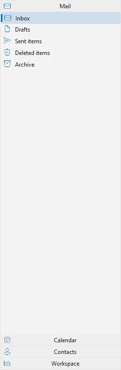

The Mail group is open
Add the bar to a form
Create the bar and dock it on the left. Give it one image list for small icons and one for large icons.
using System.Windows.Forms;
using Mordex.Windows.Navigation;

MxNavigationBar bar = new MxNavigationBar
{
    Dock = DockStyle.Left,
    Width = 250,
    SmallImageList = smallImages,
    LargeImageList = largeImages
};
Controls.Add(bar);
In Visual Studio you can drop MxNavigationBar on a form and use the Add Group verb to add groups.
Add groups and items
A NavigationGroup takes its text in the constructor. A NavigationItem takes a text, a small image index and a large image index. Add items to NavigationGroup.Items and groups to MxNavigationBar.Groups.
NavigationGroup mail = new NavigationGroup("Mail") { ImageIndex = 0, ToolTipText = "Mail" };
mail.Items.Add(new NavigationItem("Inbox", 0, 0));
mail.Items.Add(new NavigationItem("Drafts", 1, 1));
mail.Items.Add(new NavigationItem("Sent items", 2, 2));
bar.Groups.Add(mail);

NavigationGroup calendar = new NavigationGroup("Calendar") { ImageIndex = 5 };
calendar.Items.Add(new NavigationItem("Today", 5, 5));
calendar.Items.Add(new NavigationItem("This week", 6, 6));
bar.Groups.Add(calendar);
Key gives a group or an item a name. You can then find it with bar.Groups["key"] or group.Items["key"]. Enabled and Visible work on groups and items.
Open a group and select an item
SelectedGroup is the open group. SelectedItem is the selected item. Set both in code to start on a known view.
bar.SelectedGroup = bar.Groups[0];
bar.SelectedItem = bar.Groups[0].Items[0];
React when the user picks an item
ItemSelected runs after the selected item changes. Read SelectedItem to see which one it is. NavigationItem.Group gives its group.
bar.ItemSelected += (sender, e) =>
{
    NavigationItem item = bar.SelectedItem;
    if (item != null)
    {
        title.Text = item.Text;
        subtitle.Text = item.Group.Text;
    }
};
These events help too:
ItemClickruns when the user clicks an item. The item is ine.Item.SelectingItemruns before the selection changes. Sete.Canceltotrueto stop it.GroupSelectedruns after another group opens.SelectingGroupruns before a group opens. Sete.Canceltotrueto keep the current group.
Each NavigationItem also has its own Click event.
Change the style
SetNavigationBarStyle gives the bar a ready look. The values of NavigationBarStyle include Default, Office2003, Office2007, Office2010, VS2005, VS2010 and OfficeXP.
bar.SetNavigationBarStyle(NavigationBarStyle.Office2007);The bar also follows the application theme. See Themes.
Show small or large icons
View on a group sets the icon size of its items. Use NavigationBarView.SmallIcons for a list or NavigationBarView.LargeIcons for big icons.
foreach (NavigationGroup group in bar.Groups)
{
    group.View = NavigationBarView.LargeIcons;
}
Change how the bar behaves
| Property | What it does |
|---|---|
UnfoldEffect | Slide animates a group when it opens. None opens it at once. |
SelectionArea | Sets the part of an item that lights up under the mouse: FullItem or Image (the default). |
KeepSelection | Keeps the selected item drawn as pressed. |
HeaderGroupVisible | Shows or hides the group headers. |
ShowToolTips | Shows the ToolTipText of groups and items. |
Set AllowDragGroups to true to let the user drag groups into a new order. Orientation can be Vertical or Horizontal.
Put your own controls in a group
A group can hold any controls in place of items, for example a tree or a calendar. Add the group to the bar first, then set Container to true. The group then has a ContainerControl, which is a panel for your controls.
NavigationGroup folders = new NavigationGroup("Folders");
bar.Groups.Add(folders);
folders.Container = true;

TreeView tree = new TreeView { Dock = DockStyle.Fill };
folders.ContainerControl.Controls.Add(tree);
Was this page helpful?