All guides
No guide matches your search.
Show and edit data in the data grid
Bind MxDataGrid to a table, set up its columns, and let users sort, resize, select and edit rows. Rules can color cells by their values.
On this page
MxDataGrid shows rows from a data source in a table. It lives in the Mordex.Windows.DataGrid namespace. Users can sort, resize and move columns, select rows and edit cells.
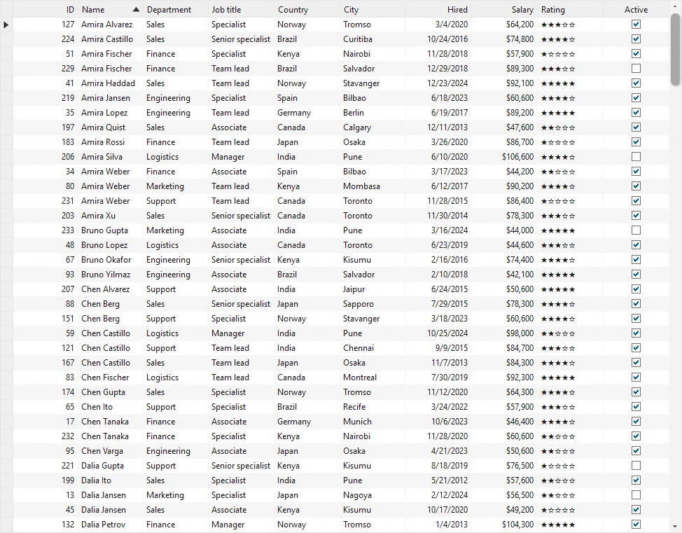
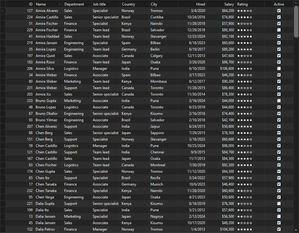
The data grid
Bind the grid to a table
Set DataSource to your data. For a DataSet, also set DataMember to the name of the table. Then call RetrieveStructure to build one column for each field.
using System.Data;
using System.Windows.Forms;
using Mordex.Windows.DataGrid;

DataTable employees = LoadEmployees();

MxDataGrid grid = new MxDataGrid();
grid.DataSource = employees;
grid.RetrieveStructure();
grid.Dock = DockStyle.Fill;
Controls.Add(grid);
RetrieveStructure(true) also builds the child tables of a DataSet with relations. The master detail guide shows this.
The columns belong to a table object. The top table is grid.RootTable, and its columns are in RootTable.Columns. You find a column by its key, which is the field name after RetrieveStructure.
Tip
System.Windows.Forms also has types named SelectionMode, View and SortOrder. When a file uses both namespaces, write the full name, for example Mordex.Windows.DataGrid.SelectionMode.MultipleSelection.
Set up the columns
Each column is a GridColumn. Set its caption, width and format after the structure is built.
GridColumnCollection columns = grid.RootTable.Columns;

columns["Name"].Caption = "Name";
columns["Name"].Width = 150;

columns["HireDate"].Caption = "Hired";
columns["HireDate"].FormatString = "d";
columns["HireDate"].TextAlignment = TextAlignment.Far;
columns["HireDate"].HeaderAlignment = TextAlignment.Far;

columns["Salary"].FormatString = "C0";
columns["Id"].Visible = false;
FormatString takes a .NET format string such as d, C0 or P0. TextAlignment and HeaderAlignment take Near, Center or Far. NullText sets the text that a cell shows for an empty value.
Show check boxes and value lists
ColumnType changes how cells are drawn. ColumnType.CheckBox draws a check box for a true or false field. Other values are Image, ImageAndText, BoundImage and Link.
A value list shows a text in place of a stored value. Turn it on with HasValueList and add pairs to ValueList.
GridColumn rating = columns["Rating"];
rating.HasValueList = true;
rating.EditType = EditType.DropDownList;
for (int i = 1; i <= 5; i++)
{
    rating.ValueList.Add(i, new string('*', i));
}

columns["Active"].ColumnType = ColumnType.CheckBox;
Sort, resize and move columns
Users sort by a click on a column header. Set AllowSort to false on a column to stop this. To sort in code, add a sort key to the table.
grid.RootTable.SortKeys.Add("Name");
grid.RootTable.SortKeys.Add(columns["Salary"], Mordex.Windows.DataGrid.SortOrder.Descending);
Users resize a column when they drag the edge of its header. AllowSize on a column turns this off. They move a column when they drag its header. AllowColumnDrag on the grid and AllowDrag on a column control this.
To size columns in code, use one of these:
grid.ColumnAutoResize = truemakes the columns fill the width of the grid.column.AutoSize()fits one column to its content.grid.AutoSizeColumns()fits every column that users can resize.grid.ColumnAutoSizeModesets what the fit measures: cells, the header, or both.
Show row headers and grid lines
Row headers are the small cells at the left of each row. Turn them on with RowHeaders. RowHeaderContent sets what they show. RowHeaderContent.RowPosition shows the row number.
grid.RowHeaders = InheritableBoolean.True;
grid.RowHeaderContent = RowHeaderContent.RowPosition;
grid.GridLines = GridLines.Horizontal;
grid.AlternatingColors = true;
Many grid settings use InheritableBoolean. Its values are Default, True and False. A setting on a GridTable overrides the same setting on the grid.
Select rows
SelectionMode sets how users select rows.
| Value | What users can select |
|---|---|
SingleSelection | One row at a time. This is the default. |
MultipleSelection | Many rows. |
MultipleSelectionSameTable | Many rows from the same table. |
MultipleCellSelection | A block of cells. |
Read the current row with CurrentRow. Read all selected rows from SelectedItems.
grid.SelectionMode = Mordex.Windows.DataGrid.SelectionMode.MultipleSelection;

grid.SelectionChanged += (sender, e) =>
{
    for (int i = 0; i < grid.SelectedItems.Count; i++)
    {
        GridRow row = grid.SelectedItems[i].GetRow();
        object name = row.Cells["Name"].Value;
    }
};
GridRow.DataRow gives the source object behind a row.
Other useful events are RowDoubleClick, ColumnHeaderClick, SortKeysChanged and CurrentCellChanged.
Edit cells
Editing is off or on with AllowEdit. AllowAddNew adds a row where users type a new record. AllowDelete lets users delete rows. NewRowPosition puts the new row at the top or the bottom.
grid.AllowEdit = InheritableBoolean.True;
grid.AllowAddNew = InheritableBoolean.True;
grid.AllowDelete = InheritableBoolean.True;
grid.NewRowPosition = NewRowPosition.TopRow;
Choose a cell editor
EditType on a column picks the editor that opens in a cell.
| EditType | Editor |
|---|---|
NoEdit | The cell cannot be edited. |
TextBox | A text box. This is the default. |
Combo | A combo box. Users can type or pick from the value list. |
DropDownList | A list. Users can only pick from the value list. |
CalendarDropDown | A drop down calendar. |
DatePicker | A date picker. |
IntegerUpDown | A spin box for whole numbers. |
CheckBox | A check box. |
MultiColumnCombo | A combo box with several columns. |
columns["Id"].EditType = EditType.NoEdit;

GridColumn department = columns["Department"];
department.EditType = EditType.Combo;
department.HasValueList = true;
department.LimitToList = true;
department.ValueList.Add("Sales", "Sales");
department.ValueList.Add("Engineering", "Engineering");

columns["HireDate"].EditType = EditType.CalendarDropDown;

columns["Rating"].EditType = EditType.IntegerUpDown;
columns["Rating"].UpDownMinimum = 1;
columns["Rating"].UpDownMaximum = 5;
LimitToList stops users from typing a value that is not in the list.
The grid raises CellUpdated after a cell value changes, and RecordUpdated and RecordAdded after a row is saved. UpdatingRecord and AddingRecord let you cancel the save.
Color cells by their values
A GridFormatCondition changes the style of a row or a cell when a value matches. Add it to FormatConditions of the table.
using System.Drawing;

GridFormatCondition lowRating = new GridFormatCondition(
    columns["Rating"], ConditionOperator.LessThanOrEqualTo, 2);
lowRating.TargetColumn = columns["Rating"];
lowRating.FormatStyle.BackColor = Color.FromArgb(255, 226, 226);
lowRating.FormatStyle.ForeColor = Color.FromArgb(160, 20, 20);
lowRating.FormatStyle.FontBold = TriState.True;
grid.RootTable.FormatConditions.Add(lowRating);

GridFormatCondition inactive = new GridFormatCondition(
    columns["Active"], ConditionOperator.Equal, false);
inactive.FormatStyle.ForeColor = Color.Gray;
grid.RootTable.FormatConditions.Add(inactive);
With TargetColumn set, only that cell gets the style. Without it, the whole row gets the style. Set Enabled to false to turn a rule off, then call grid.Refresh().
Show rows as cards
View switches between TableView, CardView and SingleCard. In a card view each record is shown as a card.
grid.View = Mordex.Windows.DataGrid.View.CardView;The grid draws itself in the theme of the application. See Themes.
Was this page helpful?